LaPrompt Blog

Ideogram 3.0 Deep Review & Comparison with 2.0 and 2a
Is Ideogram 3.0 the best AI art generator yet? Compare Ideogram 3.0 vs. 2.0 and 2a in this in-depth test review of visual quality, realism, typography, and prompt accuracy.
Introduction
On March 26, 2025, Ideogram officially released its most powerful image generation model yet — Ideogram 3.0. The announcement sparked immediate interest across the creative AI community, with early adopters praising its leap in visual quality, realism, and creative control.
Known for its exceptional text rendering and stylish outputs, Ideogram has steadily built a reputation as one of the most innovative tools in the AI art space. With this latest release, the platform aims to set a new standard, positioning version 3.0 as its most advanced model to date.
- What Is Ideogram?
- Evolution Through Versions
- What’s New in Ideogram 3.0?
- Prompt Comparison Test
- The 5 Test Categories
- Conclusion – Our Final Thoughts
What Is Ideogram?
Ideogram is a cutting-edge text-to-image generator designed to transform natural language prompts into visually compelling artwork. It quickly gained attention for one specific strength that most competitors struggled with — typography. While other AI models often distort or misspell words in visuals, Ideogram became known for its ability to accurately render clean, readable text, making it a go-to tool for posters, product mockups, social media graphics, and more.
Evolution Through Versions
Since the launch of Ideogram 1.0 on February 28, 2024, the platform has seen rapid development. Within just one year, it introduced three major updates: 2.0, 2a, and now 3.0 — each building on the last.
Ideogram 2.0
Released in August 2024, this version marked a turning point by enhancing realism and design flexibility. It introduced support for multiple artistic styles (like Realistic, 3D, Anime, and Design), custom aspect ratios, and color palette control. It became popular for its balance between image quality and creativity.- Credits per generation: 2 (for 4 images)
- Positioning: “For realism and design”
Ideogram 2a
Introduced shortly after 2.0, this version was optimized for speed and responsiveness, making it ideal for users who want fast results with minimal wait time. It retained many of the core strengths of version 2.0 and became a go-to option for rapid creative exploration.- Credits per generation: 1 (for 4 images)
- Positioning: “Fastest creation time”
These earlier models laid the foundation for what would become Ideogram 3.0 — with each step improving generation speed, style accuracy, and user control.
What’s New in Ideogram 3.0?
With the release of Ideogram 3.0 on March 26, 2025, the platform introduced its most powerful and refined model yet — described officially as “Our most advanced model.” This update brings not just incremental improvements, but a noticeable leap in quality, realism, and control.
🧠 Key Improvements in 3.0
Higher Visual Fidelity
Images generated in 3.0 feature more natural lighting, smoother gradients, and better rendering of textures, making everything from portraits to abstract concepts feel more realistic and visually polished.Improved Text Rendering
Ideogram’s biggest strength just got better. 3.0 continues to lead in typography generation, producing crisp, legible text that fits naturally into designs — from professional-quality logos, promotional posters, landing page concepts, product photography, and more.Style Reference Support
A major new feature: users can now upload a reference image to guide the aesthetic of their generations. This allows for even more creative consistency across multiple prompts and use cases — from branding to visual storytelling. For fresh style inspiration, the Random style feature offers the ability to explore a unique mix from Ideogram’s library of 4.3 billion presets. Once a desirable style is identified, it can be reused via its Style Code.Refined Compositions
The model better understands spatial relationships, layering, and depth, producing more balanced and coherent compositions — especially in complex prompts or dynamic scenes.
💳 Generation Cost
- Credits per generation: 4 (for 4 images)
- Positioning: “Our most advanced model”
Prompt Comparison Test
To evaluate how much Ideogram has evolved, we ran the same five prompts through three different versions: Ideogram 2.0, 2a, and the newly released 3.0.
Our goal was to highlight real, practical differences in text rendering, color control, composition, and creative interpretation. Some of the prompt ideas were inspired by examples shared on Ideogram’s official X (formerly Twitter) account, while others were created specifically to push the models' visual capabilities.
Each category includes:
- The full prompt text
- Four generated images from each version (2.0, 2a, and 3.0)
- A short commentary noting how the outputs compare in terms of quality, consistency, and execution
The 5 Test Categories
1. Landing Page Design
📌 Prompt:
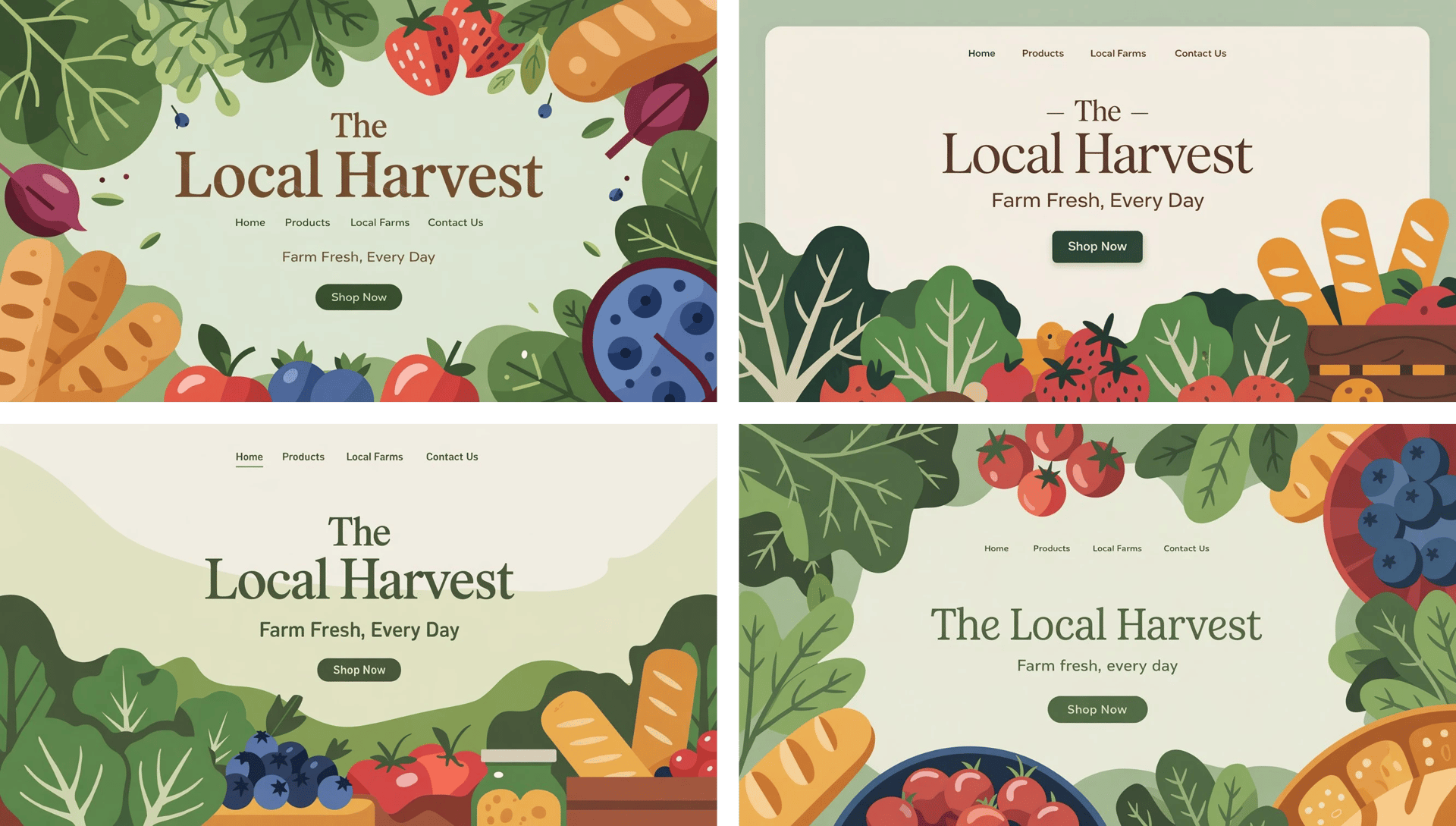
A photo of a bustling outdoor farmer's market with a variety of vibrant seasonal produce. There are leafy greens, fresh berries, and artisanal breads. The background has a soft green hue. At the top center, there is the market name "The Local Harvest" in a rustic, serif font. Below the market name, there is the slogan "Farm Fresh, Every Day". The main menu items "Home", "Products", "Local Farms", and "Contact Us" are centered and clear. Below the slogan, there is a large, welcoming "Shop Now" button. The overall image has warm, earthy tones, with a soft green background and gentle white borders, creating an approachable and organic feel.
This prompt tests layout composition, typography clarity, and design-friendly aesthetics. Style used: Design, aspect ratio – 16:9.
Landing Page Design – Commentary:
All three versions correctly recognized the task: creating a landing page-style composition based on a descriptive layout. Each version included an image of a farmer’s market, rendered a clear headline and slogan, and attempted to place menu items and a call-to-action button. Here's how they compared:
- Ideogram 2.0
Delivered the most consistent result. The background image resembled a realistic photograph of a farmer’s market with a pleasant soft green hue. The title and slogan were accurately written, with no spelling or layout issues. All main menu items were present and clearly legible, and the “Shop Now” button was visible in all outputs.
⭐ Overall impression: 10/10
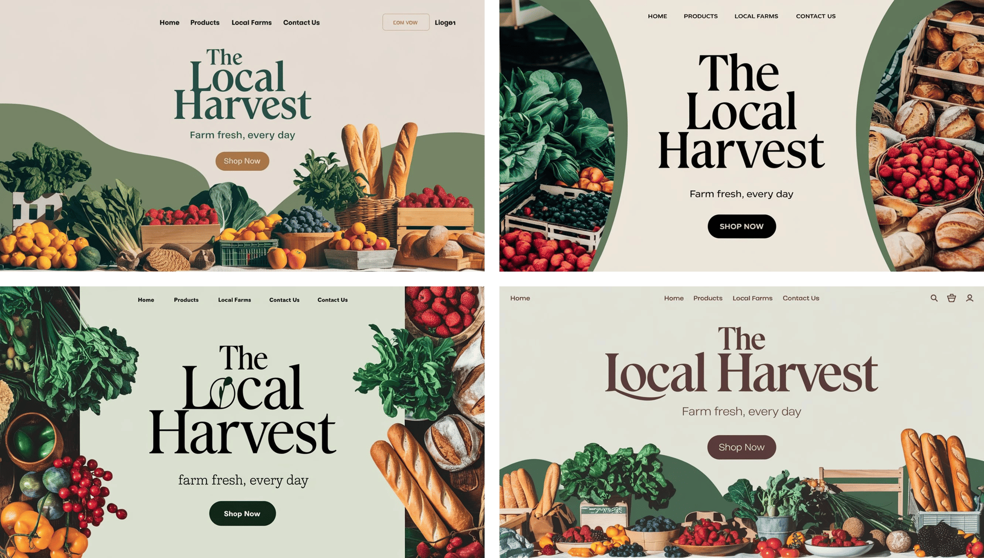
- Ideogram 2a
Took a slightly more stylized approach, rendering the background as a graphic illustration rather than a photo. While the tone and colors matched the brief, and the text elements were mostly accurate, one or two images included minor errors in menu text or omitted menu items entirely. The “Shop Now” button was consistently present.
⭐ Overall impression: 7/10
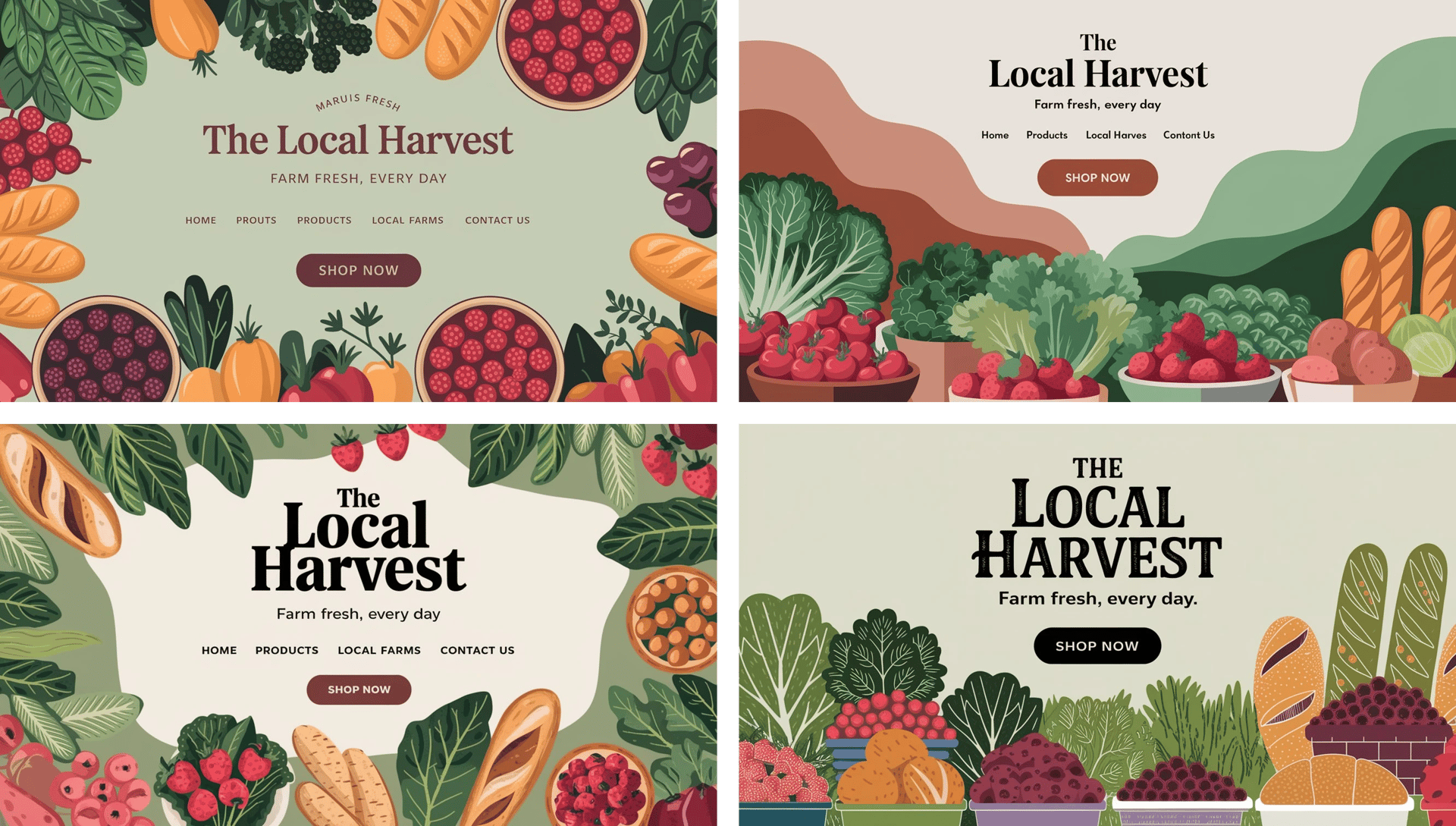
- Ideogram 3.0
Like 2a, this version produced a graphic-style background rather than a photo. However, the results were more refined: the soft green hue, rustic typography, and warm earthy tones were rendered beautifully. Text accuracy was perfect across the board, including the full set of main menu items and a clearly placed call-to-action.
⭐ Overall impression: 9/10
2. Character or Portrait Test
📌 Prompt:
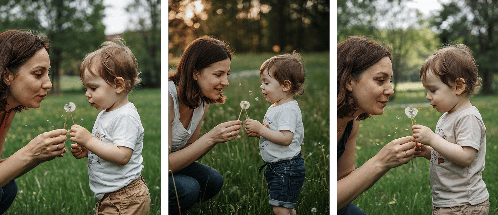
A photo of a tender moment between a woman and a young child in an outdoor setting. The woman is closely observing a dandelion she holds. The child is blowing on the dandelion, causing its seeds to scatter in the air. The backdrop is a lush green field with trees, suggesting a serene and peaceful environment.
This category is ideal for evaluating realism, facial details, anatomy, and emotional expression. Style used: Realistic, aspect ratio – 3:4.
Character or Portrait Test – Commentary:
All three versions clearly understood the essence of the prompt — a tender, emotionally grounded moment between a mother and child interacting with a dandelion, set in a natural, outdoor environment. The output from each version was realistic and well-composed, capturing the core elements of the scene: two characters, a peaceful background, and the action of blowing on a dandelion.
- Ideogram 2.0
The model produced consistent greenery and tree-filled backgrounds across all images. The emotional tone was clear, but in one case, the image mistakenly included two children instead of one. The subject positioning was uniform, with characters always placed on the left side, leaving the right side open to showcase the environment.
⭐ Overall impression: 8/10
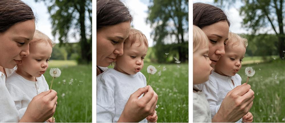
- Ideogram 2a
This version handled the scene with impressive balance. All images accurately depicted one child and one adult, maintaining the emotional nuance of the prompt. The positioning varied — sometimes centered, sometimes off to the right — adding visual diversity. Additionally, some outputs introduced sunlight and warm lighting, enhancing the mood and realism.
⭐ Overall impression: 10/10
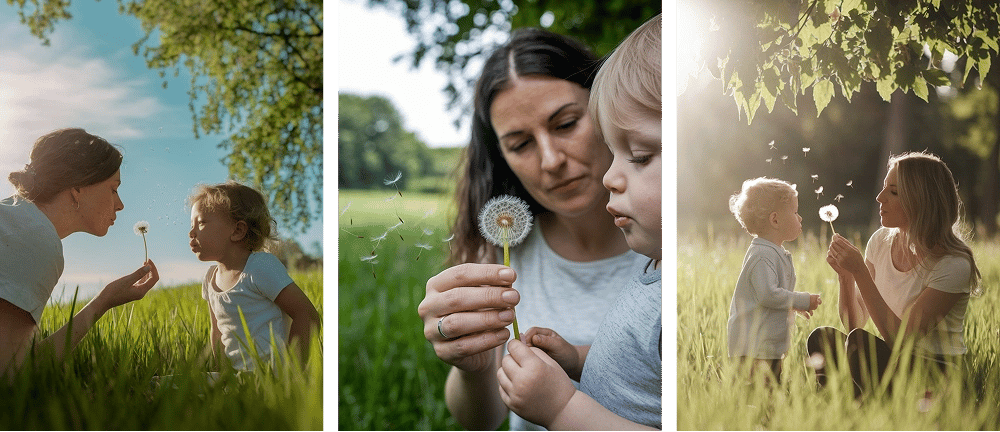
- Ideogram 3.0
All results were consistent and precise — a mother and one child, always shown with a lush green background and the correct dandelion interaction. The composition was more centralized, with both figures appearing in the center of the frame, creating a balanced and focused portrait-like result. While technically solid, it lacked some of the variety seen in 2a.
⭐ Overall impression: 9/10
3. Poster / Wallpaper Design
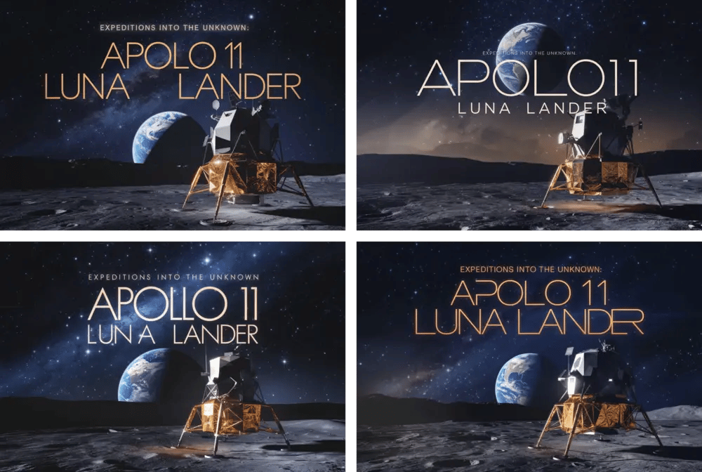
📌 Prompt:
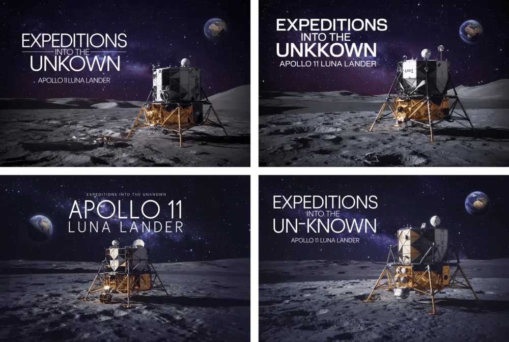
A cinematic wallpaper, titled "Expeditions into the Unknown: Apollo 11 Luna Lander", about lunar exploration. The night sky is filled with twinkling stars, and the Earth appears in the background. The foreground showcases the moon's surface, with the detailed Apollo lunar lander lit by the soft moonlight. The title is elegantly written in a futuristic font. The overall mood is awe-inspiring, evoking a sense of exploration, wonder, and the unknown.
This scene puts lighting, typography, space composition, and atmosphere to the test. Style used: General, aspect ratio – 3:2.
Poster / Wallpaper Design – Commentary
This prompt tested each version’s ability to create a cinematic, space-themed wallpaper combining detailed scenery, clear typography, and a sense of visual drama. The goal was to depict the Apollo 11 lunar lander on the moon’s surface, with the Earth in the background, a star-filled night sky, and a readable title: “Expeditions into the Unknown: Apollo 11 Luna Lander”. All three versions succeeded in producing strong compositions that closely matched the concept — but with some differences in execution.
- Ideogram 2.0
All images clearly depicted the night sky, Earth in the distance, and the Apollo lander in the foreground, positioned on the moon’s surface. The title text was accurate, free of spelling errors, and presented in a visually appropriate futuristic font. This version nailed the cinematic feel we were aiming for, with clean layout and space atmosphere.
⭐ Overall impression: 10/10
- Ideogram 2a
The scene elements were all present: stars, Earth, moon, and lander. The text was readable, but there were minor mistakes in phrasing or character spacing. While the overall style worked, it lacked the cinematic impact and visual depth of versions 2.0 and 3.0. Still, a solid output for a faster model.
⭐ Overall impression: 8/10
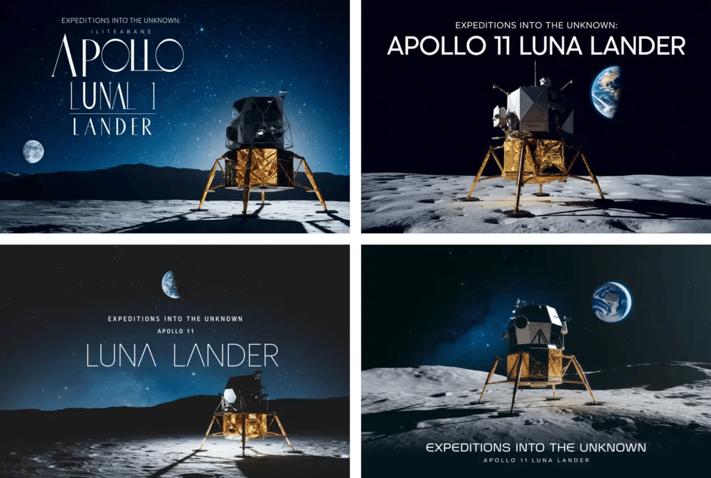
- Ideogram 3.0
Delivered a highly polished result. The background and foreground were both spot-on, with a rich night sky, crisp view of the Earth, and a detailed Apollo lander. The title was error-free, using the kind of stylized sci-fi font we described in the prompt. The visuals felt professional and immersive.
⭐ Overall impression: 10/10
4. Logo Creation
📌 Prompt:
A logo for a vacation tours company "Oasis", featuring a stylized palm tree with lush green leaves and golden fruits instead of letter I. The logo is set against a dark blue background with the brand name "Oasis" in gold lettering. A small earth icon is subtly integrated into the design, emphasizing travelling around the world. The overall composition is balanced with a sense of natural harmony and prosperity.
A good challenge for Ideogram’s trademark strength: combining imagery and clear text in one frame. Style used: Design, aspect ratio – 1:1.
Logo Creation – Commentary
This prompt challenged the models to create a logo for a vacation tours company called "Oasis", featuring a palm tree, an earth icon, and golden text on a dark blue background. We also asked for a creative touch: the palm tree replacing the letter “I” in the word “Oasis.” All three versions understood the branding concept well and delivered strong, visually balanced logo designs — though execution varied in details.
- Ideogram 2.0
All images had the correct dark blue background, and three out of four featured golden text as requested. The palm tree and earth icon were consistently included, and there were no text errors. However, none of the logos used a palm tree to replace the letter “I,” and one image used white text instead of gold, slightly straying from the brief.
⭐ Overall impression: 8/10
![]()
- Ideogram 2a
This version followed the color and layout prompt very closely. All outputs had a dark blue background, golden text, and the correct inclusion of both the palm tree and earth icon. Again, the palm tree was not used in place of the letter “I”, but the visual consistency was strong throughout.
⭐ Overall impression: 9/10
![]()
- Ideogram 3.0
The outputs were visually appealing but showed some divergence from the prompt. All logos featured a dark green background rather than blue. Text was consistently golden, and the palm tree and earth icon were present in all images. One version did creatively replace the letter “I” with a palm tree — though it’s unclear whether that was intentional or coincidental. There was also one small text error in one of the images.
⭐ Overall impression: 8/10
![]()
5. Creative Use Case Test
📌 Prompt:
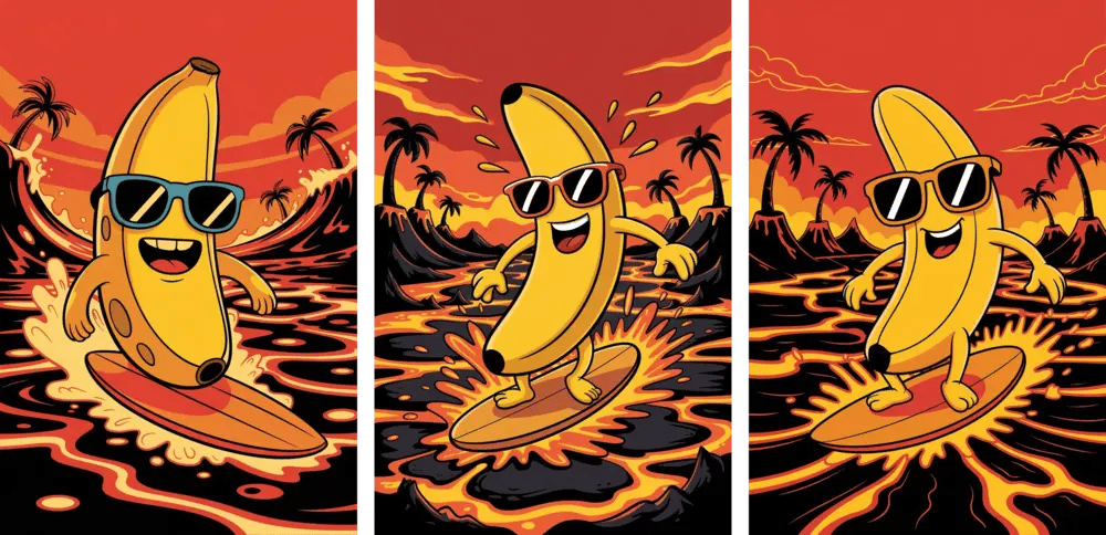
A cartoon-style scene of a happy banana surfing on a river of glowing lava. The banana is wearing sunglasses and riding a wooden surfboard, with dramatic waves of lava splashing around. The sky is a fiery red, and there are tiny palm trees in the background melting from the heat. Fun, surreal, and vibrant.
This prompt checks how each model handles surrealism, humor, color dynamics, and storytelling coherence. Style used: Auto, aspect ratio – 2:3.
Cartoon Banana Poster – Commentary
This prompt was designed to test each model’s ability to interpret a whimsical and surreal scenario — a cartoon-style image of a happy banana surfing on lava, wearing sunglasses, with a red sky and melting palm trees in the background. We used Ideogram’s auto style feature, allowing the model to select the most fitting visual style based on the prompt — and in this case, it performed beautifully. All versions generated fun, cartoonish compositions with vibrant colors and strong character expression.
Even though not all images showed the palm trees melting exactly as described, the overall quality across all versions was excellent — the style was cohesive, vibrant, and playful, fully matching the tone of the prompt.
- Ideogram 2.0
Delivered bright, engaging illustrations that fully captured the playful tone of the prompt. The banana character was cheerful and wearing sunglasses, the lava was glowing, and the sky was red across all outputs. Palm trees were present, but they appeared intact and untouched — not melting, as the prompt specified.
⭐ Overall impression: 9/10
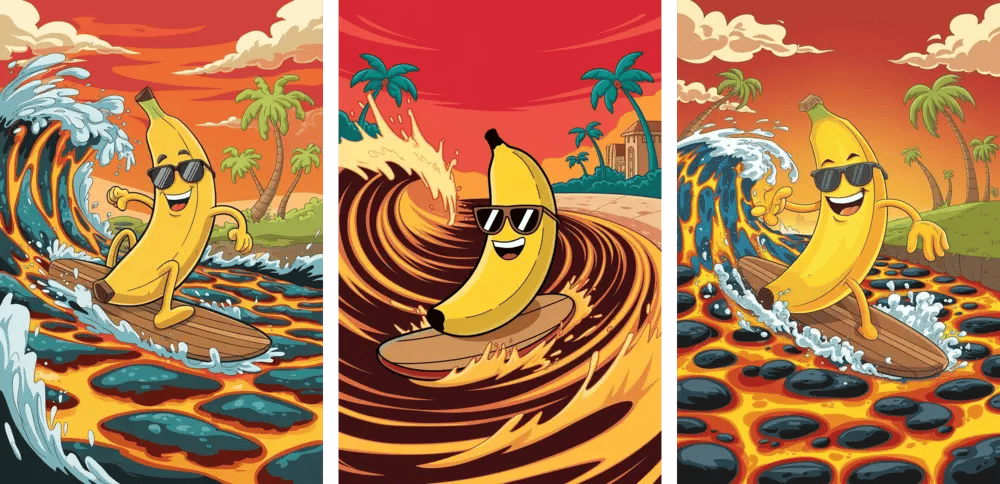
- Ideogram 2a
The results were lively and cartoonish, with a consistent representation of the surfing banana in sunglasses. However, some images lacked the red sky, and while palm trees were included, they again did not show signs of heat damage or melting. Still, the overall style was strong and enjoyable.
⭐ Overall impression: 8/10
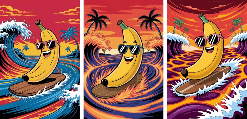
- Ideogram 3.0
This version hit every point. The banana, surfboard, lava waves, and red sky were all perfectly captured. Notably, the palm trees in the background appeared blackened, creatively implying they were melting from the heat, just as described. The scene was cohesive, fun, and visually polished — and the style felt spot-on for the concept.
⭐ Overall impression: 10/10
Conclusion – Our Final Thoughts
After running five very different prompts through all three versions of Ideogram — 2.0, 2a, and the brand-new 3.0 — one thing is clear: each model has its strengths, and version 3.0, while powerful, isn’t necessarily the best in every use case.
What Did Ideogram 3.0 Get Right?
Version 3.0 impressed us with its consistency, visual polish, and creative accuracy. It nailed the cinematic wallpaper test, delivering flawless text, composition, and atmosphere. It also stood out in the surreal “banana surfing on lava” prompt, interpreting the scene with humor and style while even capturing fine details like the melting palm trees.
Where Does It Still Fall Short?
Interestingly, 3.0 wasn’t the best in every test. While its results were consistently high-quality, it did not outperform its predecessors in every category. For example, it slightly missed the background color specification in the logo prompt and wasn’t as versatile as Ideogram 2a in portrait generation.
This reinforces the idea that “newest” doesn’t always mean “best” for every scenario — different models may suit different creative needs.
Which Version Performed Best?
🏆 Landing Page Design: Ideogram 2.0 delivered the cleanest, most realistic composition — with perfect text and layout.
🏆 Character Portrait: Ideogram 2a stood out with emotional tone, proper lighting, and facial accuracy.
🏆 Logo Design: Ideogram 2a again performed best with clean, consistent results and strong adherence to the brand feel.
🏆 Poster / Wallpaper: Ideogram 3.0 created cinematic, professionally styled designs with perfect text – very similar results were achieved with Ideogram 2.0.
🏆 Creative Cartoon Scene: Ideogram 3.0 interpreted the fun, surreal concept perfectly — playful, coherent, and visually bold.
Who Should Use It — and For What?
Use Ideogram 2.0 if you're working on web mockups, product visuals, or need structured design with clean text.
Use Ideogram 2a when speed is essential and you want solid results for people, portraits, or branded elements.
Use Ideogram 3.0 for cinematic compositions, storytelling visuals, and any project that demands advanced style handling and atmosphere.
Is It Worth Switching to 3.0?
If you're already deep into Ideogram, yes — 3.0 is absolutely worth trying. It’s a refined, powerful tool that handles both realism and creativity exceptionally well. But that doesn’t mean you should abandon 2.0 or 2a entirely. In fact, depending on your needs, a mix of all three may give you the best creative flexibility.
Try It Yourself & Join the Discussion!
We highly recommend testing Ideogram 3.0 with your own prompts — especially the ones that demand complexity, style accuracy, or cinematic flair.
💬 Which version do you prefer — and why?
Drop your thoughts in the comments below! If you generate something that looks amazing or unique, don’t keep it to yourself — submit it to LaPrompt and share your creativity with the community.
The future of text-to-image generation is evolving fast. And the best way to be part of it… is to experiment with it.